Annekdoten with the AI
AI helps me create hero images for articles. The fact that this can go (horribly) wrong because AI can't (yet) do everything, allows me to report on sexism in image generation.
Lately, I've been using ChatGPT – previously DeepAI – to create hero images for my articles. I used ChatGPT for my article on the Pareto Principle. You can see the final result in the article. I don't want to withhold the process and the interim results from you.
1st draft: My Basic Prompt
I've developed the habit of creating the first image in ChatGPT using the following prompt. Sometimes I add the phrase "in comic style" if I think it's appropriate.
Create a 16:9 hero image for the following text: <Body text of the article
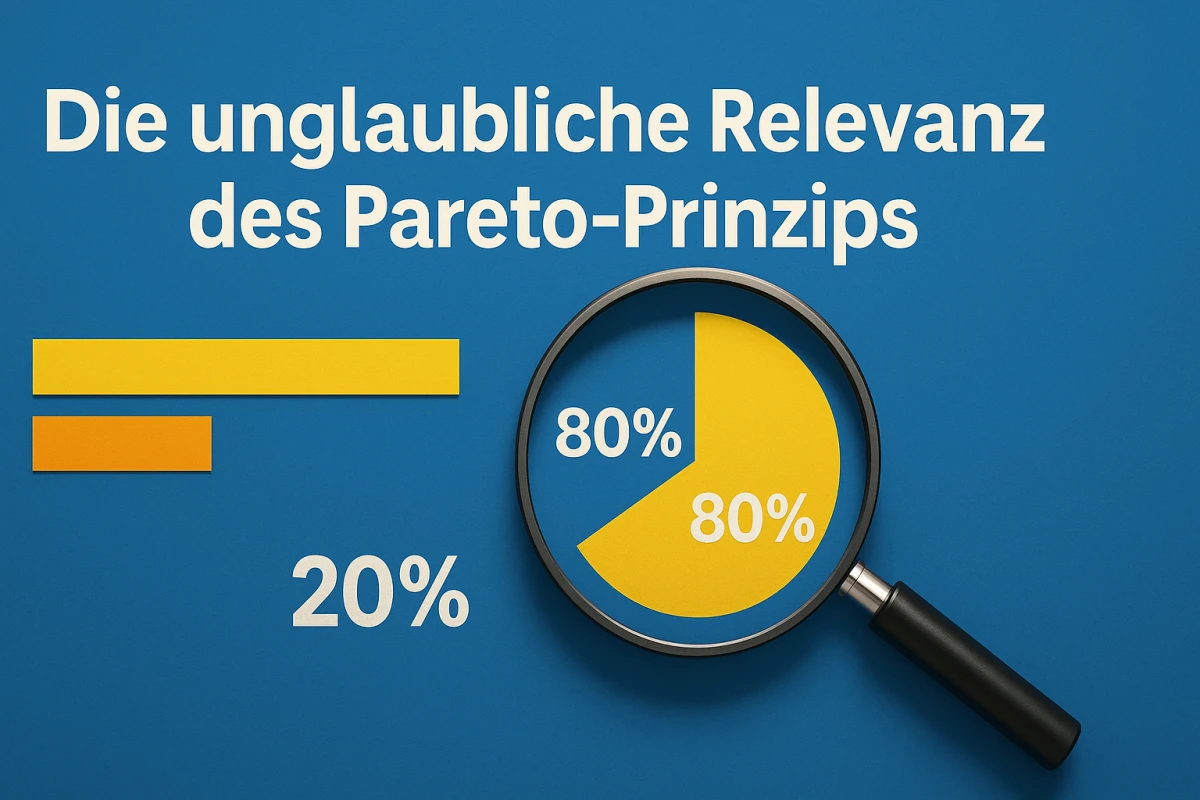
2nd draft: Let's adjust the errors
My blog is bilingual. However, I only use one image. If there's text in the hero image, please ensure it's in English. That's why I had to adjust the above picture. Attentive viewers will have guessed that I'm not satisfied with the percentages and the pie chart. These requests were addressed in the following prompt.
Create another image, but without text, just numbers. Please display the pie chart correctly in proportion.
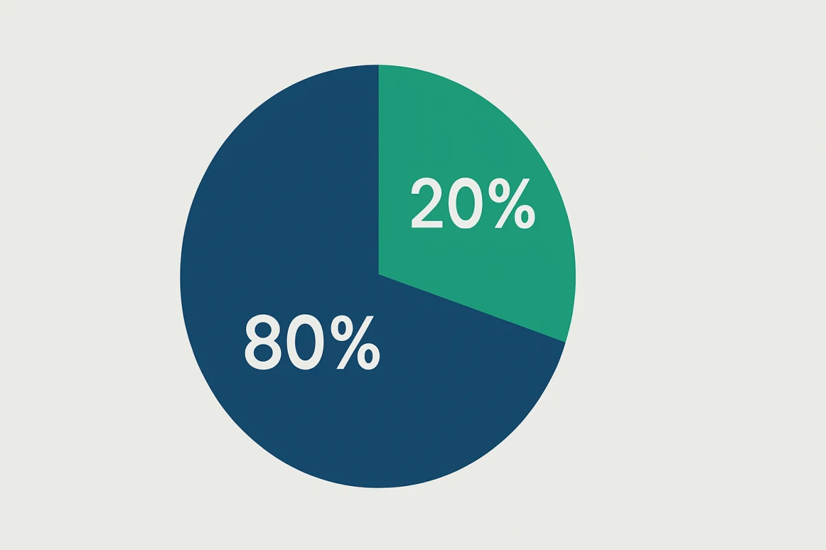
3rd draft: We Need a New Approach!
I wasn't satisfied with the new result. I'm not sure how to describe my reaction. Hysterical laughter probably comes closest. I have little hope of continuing on this basis. So, ChatGPT should start from scratch and hopefully generate something more appropriate.
Create an entirely new image from the initial text, containing people and a real-life scene that illustrates the Pareto Principle. However, all without text in the image.
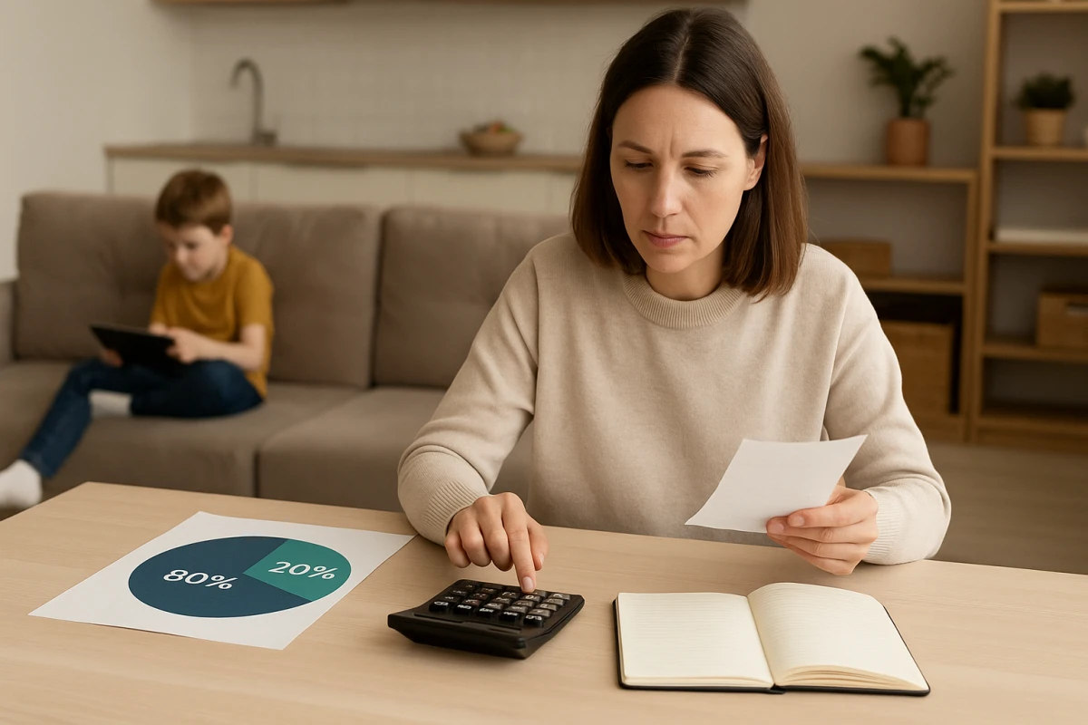
4th draft: The scene might look better drawn
Due to my limited experience, I'm unsure if a vague prompt is effective. However, a mother-child scene as a hero image doesn't suit me. At the same time, I find it fascinating how consistently incorrect the 80-20 pie chart is. It seems to me as if attempts to display a clock with a specific time are similar to the failure I see here, because the AI has learned something different. If I have to accept that, I'll hope for a better comic-style image.
Convert image to comic-style
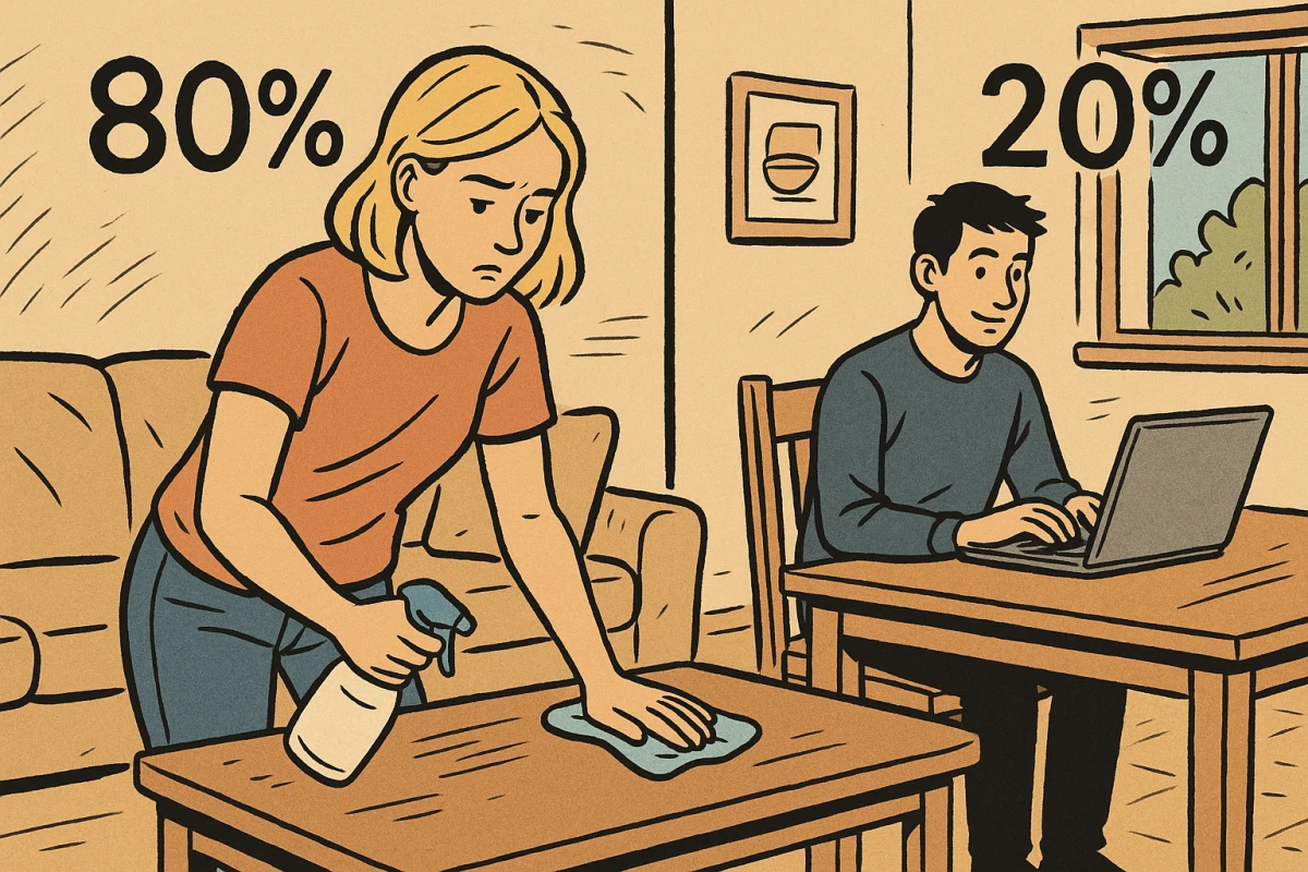
I give up
The last image is the last straw. The 80% (unpleasant) effort is depicted as a woman cleaning. The high-performing 20% is portrayed as a happy man working (yes, there's a lot of my socialized perspective in that interpretation). There's so much wrong with this image on so many levels. Was the AI trying to be ironic or funny? I don't think so. That's the result of the data used for learning. Ultimately, this image illustrates one of the many problems I see with the unsupervised use of AI.
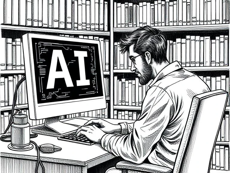
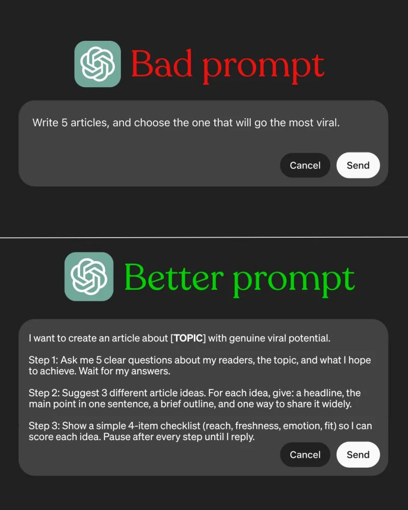
Tips for myself
In keeping with this, I recently received an image with instructions for better prompts. I'll keep this in mind in the future:
Conclusion
No matter what prompts I write, I end up wondering what the AI is capable of:
With that in mind, Happy Prompting
